
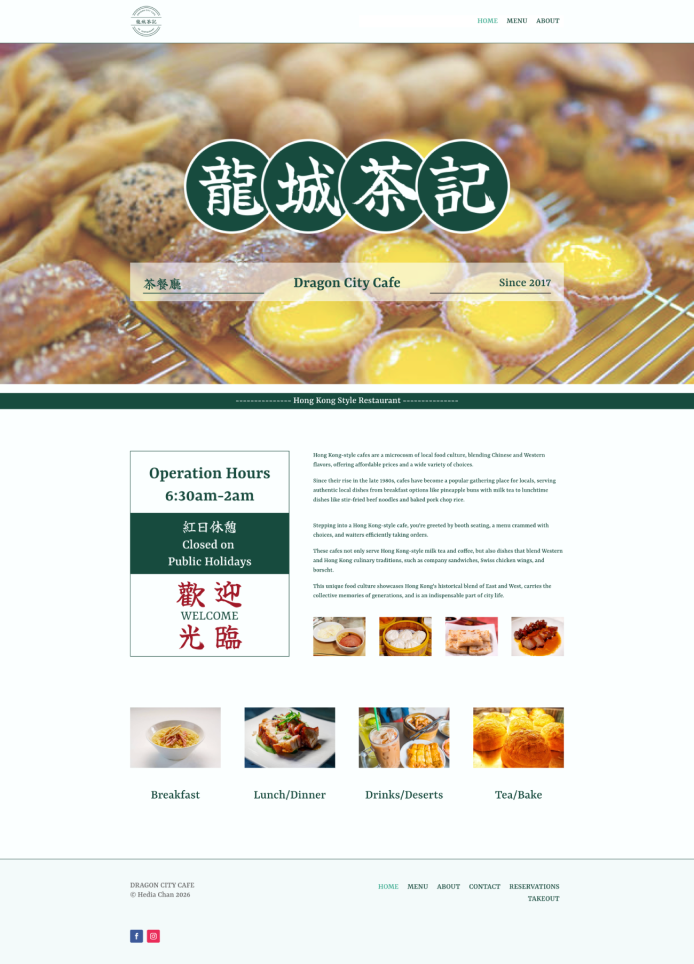
Look at the home page and how the navigation leads to menu, location and reservation information.
The problem
The goal was a clean, functional and fully responsive website for a Cha Chaan Teng (Hong Kong–style café) that works on desktop, tablet and mobile. I had to build it with Divi's core modules instead of designing without limits, and keep it fast to load and easy to scan, so people can quickly find the menu, location and reservation information.
I researched existing restaurant websites on Pinterest to learn common UI patterns and user flow. I also researched Hong Kong–style cafés to understand their cultural identity and how to reflect it in the branding and design.
What I did
- Created a wordmark and a dark green brand identity inspired by Hong Kong–style restaurant interiors and construction materials.
- Chose Yrsa as the main font for readability and Yuji Boku for Chinese text to reflect the Cha Chaan Teng's cultural identity.
- Mocked up Home, About, Menu and Contact in low to mid fidelity in Figma to plan layout, structure and content hierarchy.
- Built all pages in Divi with its section, row and column system and core modules, using optimized free stock photos from Pexels, and added a favicon.
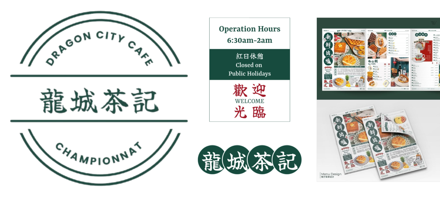
Look at the wordmark and sign drafts that set the dark green used across the site.
Key decisions
Simplifying the design to fit Divi
When I rebuilt the Figma mockup in Divi, the Box Model and module limits meant some design ideas did not work as drawn. I adjusted the layout and simplified the design to fit Divi's core modules, while keeping the branding and content hierarchy intact.
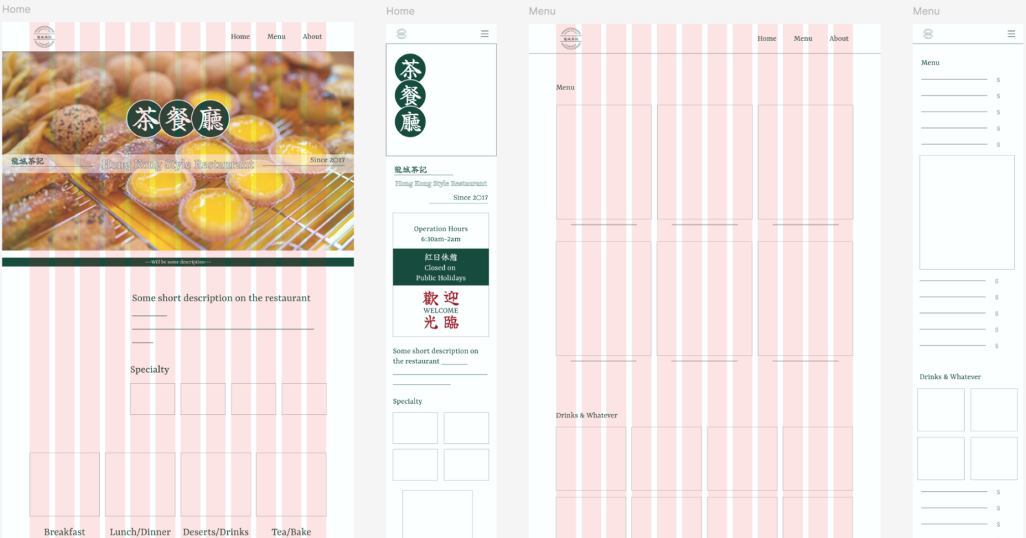
Before: look at the layout I planned in Figma.
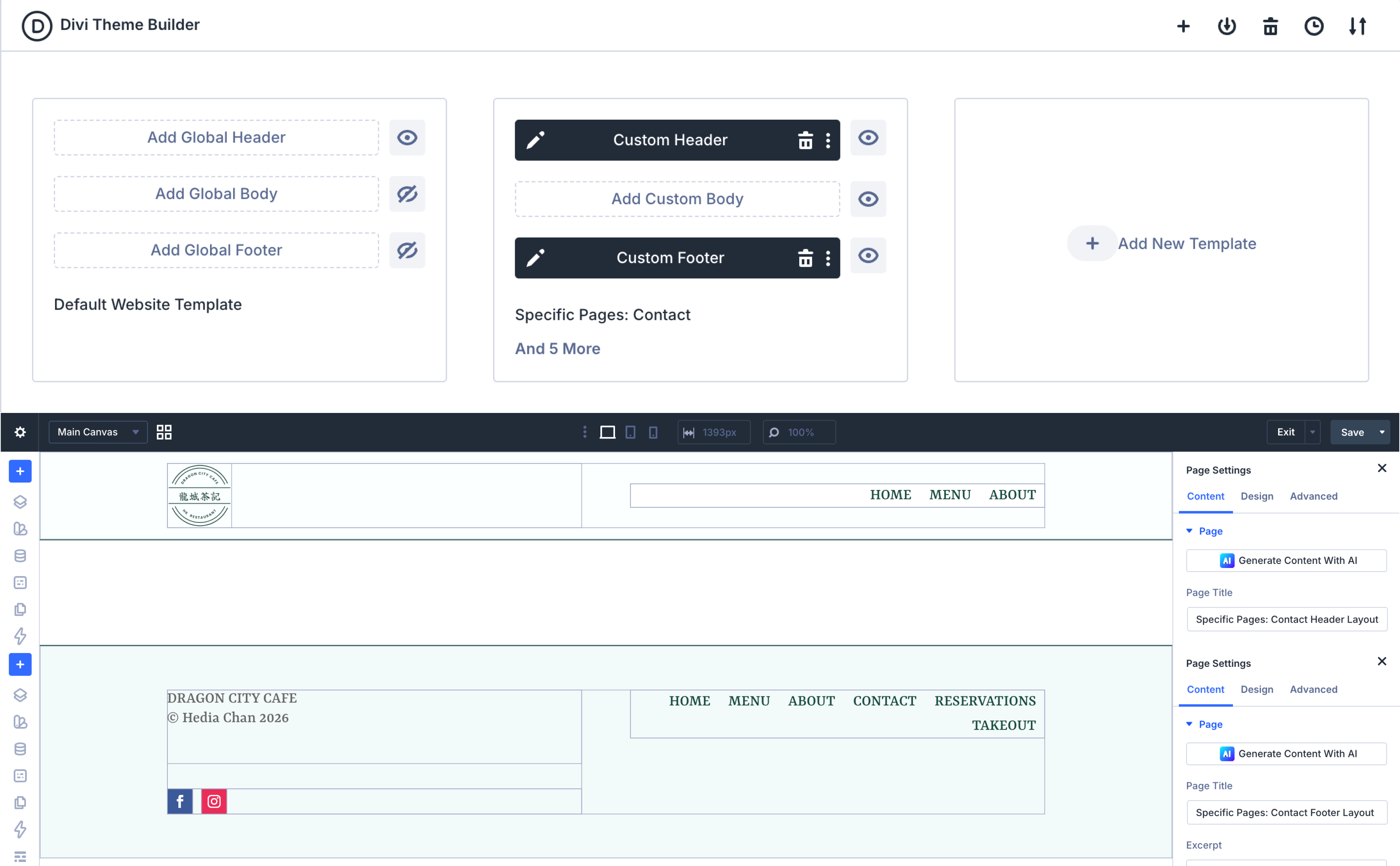
After: How the hedading and footer was rebuilt in Divi's Theme Builder.
Testing every screen size
I adjusted spacing, stacking and image sizes until the layout held on desktop, tablet and mobile.
The final design
Four pages: Home, About, Menu and Contact/Reservations. They share the same navigation, layout and branding, and they work on desktop, tablet and mobile.
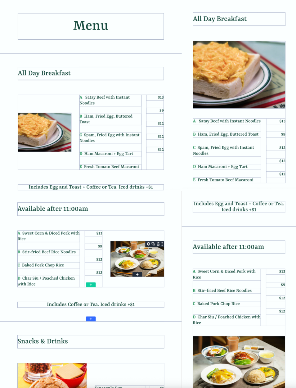
Look at the Menu page on mobile and desktop, with box borders showing how the layout is built.
What I learned
Design in Divi’s blocks: Everything in Divi is built from rows and columns, so I learned to plan layouts in those blocks from the start instead of designing freely in Figma.
Design for speed: I learned to optimize images and use Divi’s built-in features to keep the site fast to load.
Next step: Measure page speed and optimize images further.